patekova
1431

A Trio Of 5131 Cloissone World Times
I am happy to share these images with the Forum members. I feel extremely! fortunate to own these three WTs.
I am very curious to read how the forum members compare the 3 to each other in terms of preferences and general observations.
I will be happy to start.
In examining many 5131s in photos and in person, it is apparent to me that each one truly is "unique" - it is not just hype. Within each of the metals individually, I see slight and sometimes large variations in both the colors utilized and how the colors are spread across the maps, including gradations in colors along the borders of the countries/continents.
For me, initially I thought I would easily like the J the least. The colors are not as vibrant as the R or G and yellow is my least favorite metal. Further, large areas of the continents are of solid color, particularly green, while the R and G have much greater use of multiple colors within the continents. However as I closely compared the 3, I developed a much greater appreciation of the J. The map for me is extremely well balanced with the Atlantic Ocean separating the continents. The large open expanses of ocean while reducing the amount of space for the continents makes reading the map easier and clearer.
The R is fantastic. I love rose, the colors are vibrant, the map is well balanced like the J, with the Pacific Ocean separating the large land masses. I noticed many of the Rs are more colorful than mine, with a greater use of shades of orange. Maybe the colors in mine are more representative of reality. Don't know. The extensive use of green works extremely well with the rose case.
The G pretty much seems to have it all. Extensive use of blue goes well with the white metal. The colors are perhaps even more vibrant than the R, but the map is not quite as balanced as either the J or the R. I love the shadings and gradations of color.
I can stare endlessly at these miniature works of art and only appreciate each one all the more.
Overall, which do I prefer? Very difficult to say and very much subject to change of viewpoint. But, not to avoid my own question - Rose at #1, White at #2 and Yellow at # 3. However I kind of view them as 3 parts of a whole, like a triptych in art.
How do you guys compare the 3?
Thanking you in advance for your thoughts and
Best regards,
patekova
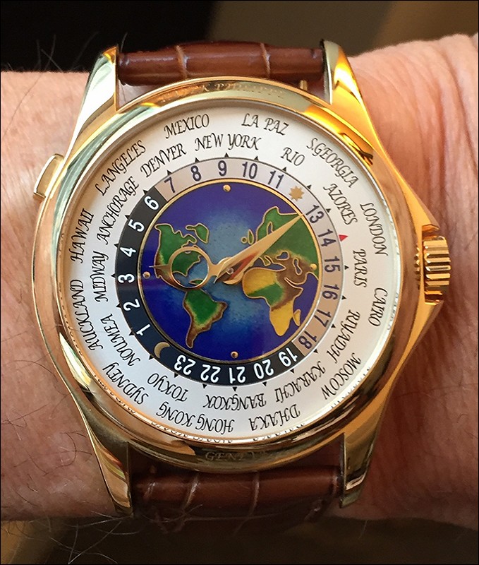
5131J
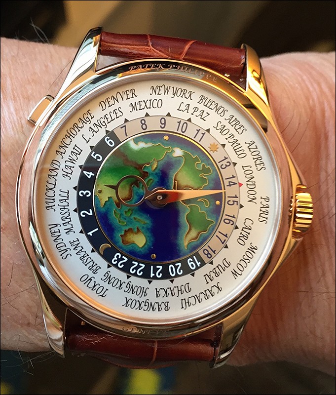
5131R
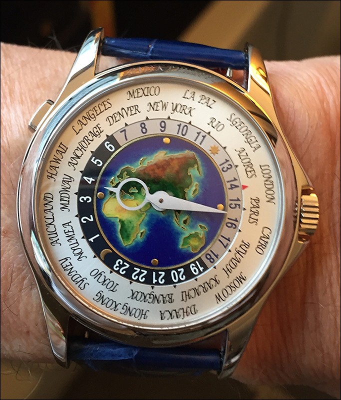
5131G
This message has been edited by Mark in Paris on 2016-06-17 13:45:11
More posts:
A Trio Of 5131 Cloissone World Times
I am happy to share these images with the Forum members. I feel extremely! fortunate to own these three WTs. I am very curious to read how the forum members compare the 3 to each other in terms of preferences and general observations. I will be happy to s...

Patekova.....
.....thanks for sharing this. I think most people here would be happy with any single one of them. However, you do ask a specific question, and so I will give a specific answer. My order is the same as yours. I prefer R most as i feel it has a vibrancy an...

Tough choice.
I too prefer the R - because the warm, brassy colour (esp the hands) recalls old navigational instruments. The effect is a Lilliputian such instrument.
Thank You Baron
for your detailed and cogent analysis. Yes, I couldn't believe my good fortune when I got the first one. I never expected to get more than one, but I hoped and was way beyond thrilled to get the others. I very much realize how fortunate I am to have them....
May I also say.....
....i admire and respect the manner in which you presented these watches. Classy.


That is one rare trio. OMG!
What a great WT collection. I am trying myself to collect all 4 5110s (I\'m half way (p and r) ...). My choice : the R. I love the case and the cloisonné is IMO perfectly balanced. But I would give a better opinion if I had all 3 right now on my desk.
I do love them all. The 5110p is really my favourite and my everyday and travelling watch.
Thank you for sharing this trio. This is incredibly rare. How is the rest of your collection? As fun and unique?


Oh wow!
You must be a very special customer of Patek. Well done on securing all three! Like many others, I am waiting for the rose gold version and I pray it will not be discontinued until we all get ours! I live in Europe and originate from Malaysia so the white...
Thank you Sham for your very kind words!
I hope you get the R and sooner rather than later. As for the P, as my Dad would say "Hope springs eternal".

Hi Patekova, congrats on collecting all three ! What an awesome trio !
I have had the opportunities to examine all three and the good fortune of owning the G. IMO, each of them has certain aspects that are better than the other two. In terms of realism and color matching, R is top because patches of white ice cap are shown w...
Thank you Gordon for your reply and great analysis!!
Your breakdown of the strengths of each based on specific colors is insightful and thought provoking. Unfortunately, your comment about the ice caps and global warning is a sad, but accurate statement of where things seem to be going. I assume there will ...

Awesome trio!
Congratulations on the latest addition. It is fascinating to see the differences in all the R\'s as more pictures get posted, from some with no snow to as you say some with more orange/yellow. All are truly stunning and so difficult to have a favourite bu...
Thank you Russell996 for your kind words
Also for pointing out something I hadn't noticed, namely that some of the Rs do not have snow caps in the Arctic regions. This is another illustration as to how each one is onto itself.

Thank you Patekova.....
for shearing these beauties. For me the yellow gold is the first choice, simply because I believe it to be the most traditional and I like it the most. Following the rose gold and then the white gold. The enamel is a state of the art on all of them and th...
My pleasure Edward to share images of the watches.
I also think the yellow is very appealing and I am glad to see that at least one Patek collector rates it #1!

They have been very seriously designed
Patek has brought a lot of attention to the details of this watch. As always we may say but the enamel work of this very 5131 reference is another story and brings the interest to another level IMHO. I would go for R then G then J personally. I like RG a ...
Mark, thank you!! for your very detailed and thought provoking reply
I would like to focus in particular on what you said regarding the differences in the enamel work within a particular gold model, be it rose, white or yellow. The first one that I acquired was the J. I was ecstatic to get it and thought the map was beauti...
I think you experienced something very much linked with the enamel work
These details differences and diversity in such dials are something we may not expect at first. How they spread the material before cooking, how it behaves during the heating process etc... everything has an impact an enameler cannot totally control. It o...
Mark, your analysis of the enameling process is insightful and explains the diversity, so thanks!
I recall that after the introduction of the J, Patek had major problems with the enameling process, specifically many dials cracked during the baking process and had to be discarded. Obviously, they corrected the problem, but it points out the fickle natu...
Hi Patrkova, I have previously read an article interviewing Thierry Stern and I recall that he said...
there was a mother and son team that worked on the dial. Perhaps there were 2 teams, one for J and one for G. Hence the workmanship is different and that is why each dial is unique. Due to good fortune, I had the choice of a J or G and checked out both wi...
An excellent photo of the 3 enamel WT siblings together! Analyzing this photo, my previous assessment of their rankings ...
remains the same: G & R rank equally at the top and J is the most eye-catching with its bright yellow Africa.

All 3 are beautiful. Functional works of art.
WG is the best for me , RG , then the J. But the other 2 are no pushovers. Just my personal preference. Good you have all 3 in your stable. My admiration. Cheers Geross.
How did you get all 3?
Did you get an allocation from the same AD, or different AD per piece? Since it's an application watch, PP would know this allocation.. just wondering how this works.. Thanks

3?
Yes I know, life isn't fair! G would be my choice as I tried on a friend's piece and it was absolutely stunning. cheers fernando
Final result (to date) of this informal survey The winner is:
R with 9 votes. Second place goes to G with 4 votes. And last but still beautiful is J with 1 vote. A BIG thank you to all who took the time to share their preference and thoughts!! Best, patekova
My pleasure. And thanks for all your detailed and informative reviews.
And especially thanks for taking the time to respond to all the questions/opinions and posts of the Forum members!
Much appreciated Patekova, thank you :)
It is always a real pleasure discussing with such a community.

J or R for me
the G is nice too but the multi colored dial imo needs a warm colored case too
Bruno, thank you for your reply and very interesting viewpoint on the G
I actually have the opposite preference on the case for the G. While the G is not my favorite map, I feel that the colorful dial with an emphasis on blue works really well with the white metal. Hearing a well reasoned opposite view makes the discussion al...
Definition of great art?
Something that makes you keep looking at it...... The 5131 has that!
Baron, thank you for your analysis. Never thought of 5131 as "great art", although
I do view it as a miniature work of art. However, maybe you are right. What constitutes great art is generally considered to be quite subjective. Yet you give a quantifiable measure which makes a lot of sense. Provided the reason one keeps looking at a wo...